In February this year, staff and members of our Board participated in a series of brand workshops.
Through various exercises and discussion, we examined our organisation from all angles to gather opinions and perceptions about our purpose, mission, and vision for the future.
We reviewed our current brand and communications within the broader landscape to help identify strengths, weaknesses and opportunities for our new name, logo and brand.
These workshops were key in gathering valuable insights from different people within our organisation that were used to inform the final brand strategy.
Our decision to rename was two-fold. Firstly, we wanted to address and eliminate the confusion over our name, Safe Futures, with that of our referral partner, Safe Steps. Secondly, we wanted our name to reflect our new strategic direction and foundation of what it is we do.
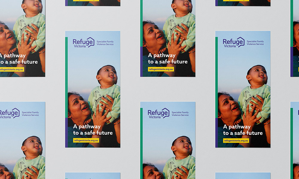
The word refuge is defined as: ‘a place or situation providing safety or shelter from pursuit, danger, or difficulty’, and the word Victoria defines our geographical parameter. When combined, Refuge Victoria is clear, ownable and succinctly describes what we do.
Our new logo signifies protection and shelter with an open house that shows Victoria symbolically sheltered by ‘Refuge’.
The new brand’s colour palette of purple, green and white embodies the Women’s Liberation Movement and also includes a warm yellow to reference the organisation’s history as Safe Futures.
The illustrated line work that carries through our extended brand highlights that the path to living safe and free will take many turns however Refuge Victoria is here to guide and empower survivors along the way.
We’d like to thank all who contributed to helping bring our new brand to life.